Faye Blais
Creative Director/Designer
Forty Six North Brewing
Deliverables: Visual Identity, Packaging
Role: Branding, Design
Description: Forty Six North is a local brewery and taphouse in Northern Ontario, focused on small batches and high-quality ingredients. With top-tier brews ranging across all styles, it is a true gem where fresh craft beer on tap is hard to find.
The problem: Create a visual identity that cuts through the noise of ever-changing brands and labels in the craft beer industry.
The solution: Less is more. Forty Six North’s branding is a visual representation of it’s founder - Graham - who executes at a high-level on all fronts, while maintaining a laid-back and playful attitude, utilizing only what is necessary to achieve pure greatness. We wanted the brand to stand out with a simple and elegant design, focused on the essentials, with a splash of colour to differentiate the varietals.

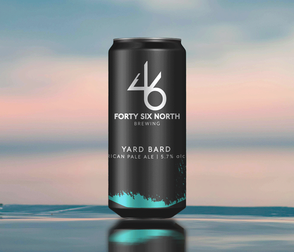
The Logo: The original logo was based on a sketch from the founder, linking the numbers 4 & 6. A tree line was added into the negative space of the 4, to symbolize the northern pines.
The Labels: The main “colour splash” on the label design is an abstract combination of The Big Nickel (the city’s crown jewel), and the silhouette of the nightly slag dump at the local nickel mine in Sudbury - where a fiery haze lights up the horizon each night.
A core list of colours represent repeating styles for individual products, to help customers quickly identify the style they’re looking for on the shelves. For specialty brews and collaborations, we have elaborated on the concept with some fun and engaging designs - a playful “easter egg” long game with customers, mostly surrounding musical/band references and local landmarks.


Key Takeaways: A major lesson learned with this project was anticipating scale from the beginning, both from a design and packaging perspective.
Being a small batch brewery, keeping costs low and turnaround quick is paramount. Establishing a design that has a strong visual foundation, rooted in the culture of the founder and the community, offers a great starting point for all future designs. It also allows the client to have some autonomy over branding materials and collateral, while keeping in line with it’s visual identity.